
Designing Investment Dashboards That Turn Complex Data Into Better Decisions
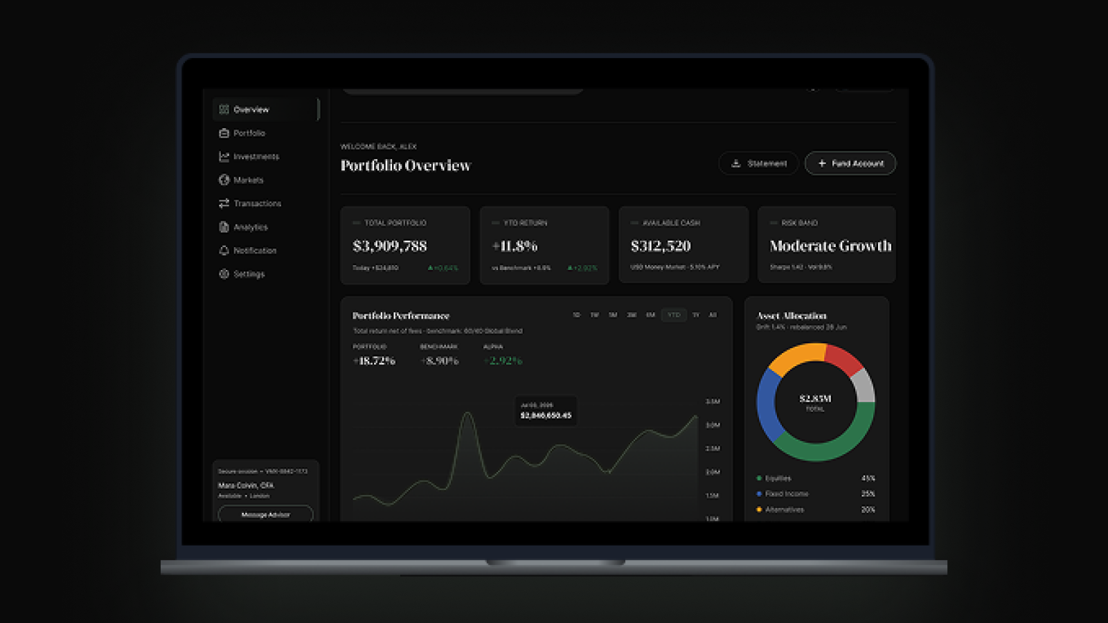
A useful investment dashboard does more than display portfolio data. It connects performance, risk and market context so investors can understand what changed, why it matters and which decision should follow.
 By Lokomax Studio
Investment dashboard design is often treated as a data visualisation exercise: collect market data, place performance metrics into cards and add charts. That approach can produce an impressive interface while leaving investors and portfolio teams unsure what the numbers mean or which decision should come next.
Investment teams do not need every available data point presented with equal emphasis. They need a decision environment that separates meaningful signals from background noise, connects performance to context and makes important changes easier to understand. A useful dashboard simplifies complexity without removing the evidence needed for sound judgement.
The strongest investment interfaces are organised around decision questions rather than data sources. What changed? What is driving the movement? Where is the risk or opportunity? How is the portfolio performing against expectations? Which decision should happen next?
What Makes an Investment Dashboard Decisive
Signal Over Volume
Lead with the few performance signals that can materially change an investment decision today.
Context Behind Performance
Connect returns and movements to market conditions, portfolio allocation, risk and underlying drivers so investors can judge significance.
One Investment Language
Use consistent definitions for performance, risk, exposure, allocation and benchmarks across the investment experience.
Insight Into Action
Every important signal should help investors understand what changed, why it matters and which decision or action should follow.
An Investment Dashboard Should Reduce Decision Complexity
Investment decisions depend on performance, allocation, risk, market movements and changing conditions. When these signals appear as disconnected charts and metrics, investors must reconstruct the story themselves. The result is more information without necessarily creating more clarity.
A decision ready dashboard creates a clear path from signal to context to action. The first layer shows portfolio health and meaningful changes. The second explains what is driving performance, risk and exposure. The third supports deeper investigation and comparison. Investors should be able to understand what changed, why it matters and what deserves attention without moving between disconnected views.
Different roles require different decisions
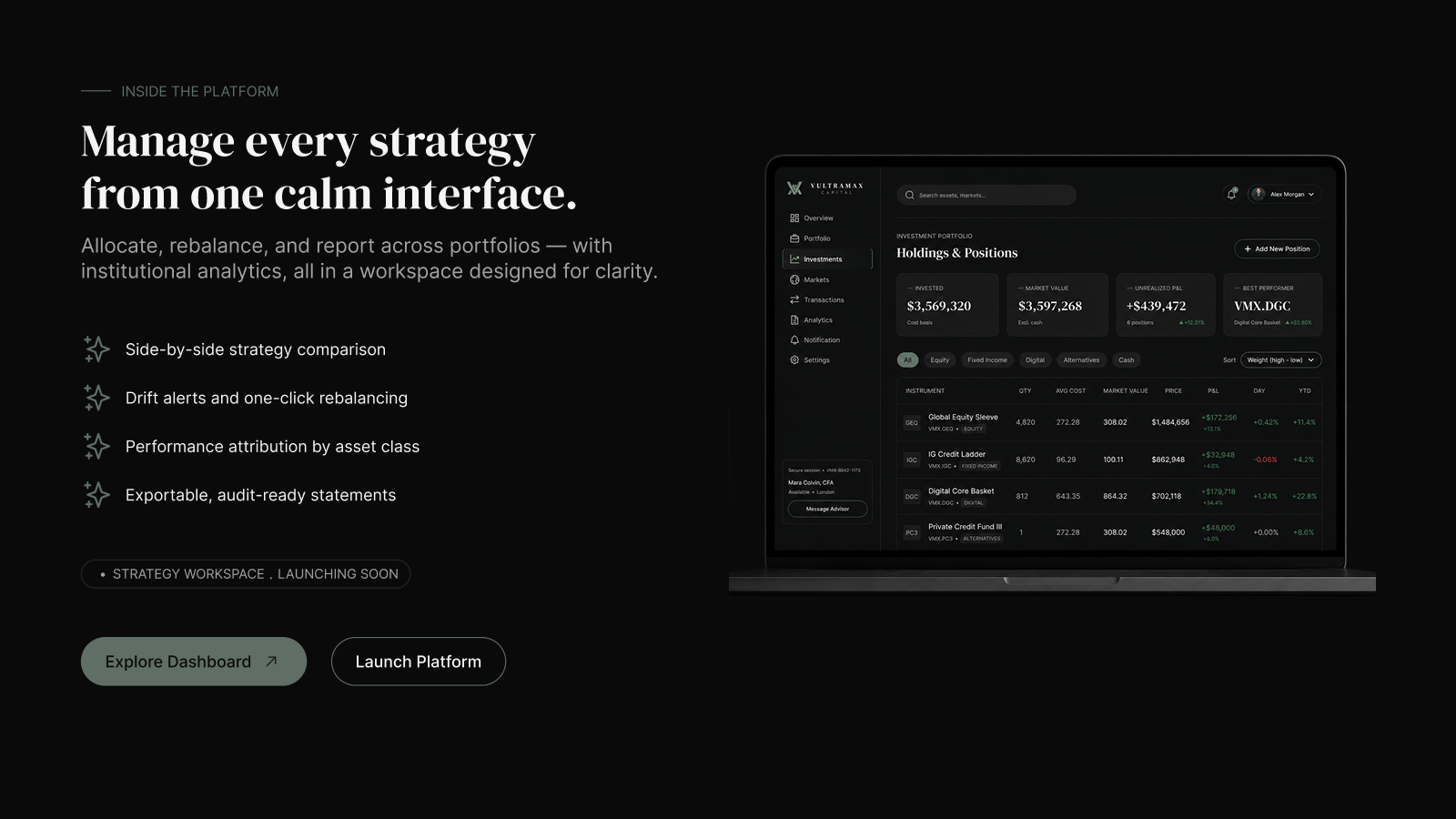
An investment leader may need performance and strategic exposure, while a portfolio manager needs asset contribution, risk and benchmark comparisons. Analysts may require deeper historical data and underlying drivers. A shared data foundation should therefore support role specific views without creating inconsistent definitions.
Performance needs context
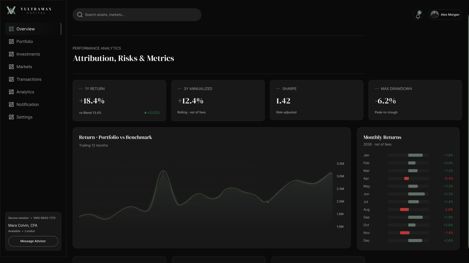
A return percentage tells investors what happened, but not necessarily why. Connecting performance to allocation, holdings, benchmarks and market movements turns a number into an insight. The dashboard should make these relationships easy to understand so users can move from observing performance to making a more informed decision.
From Complex Investment Data to Decision Ready Insight
A dashboard becomes decision ready when every important metric has a clear purpose, an understandable definition and a path to deeper evidence. Portfolio return, exposure and risk should not appear as isolated numbers. Each signal needs a relevant benchmark, time period and explanation of the holdings or market conditions that influenced it.
Design the information hierarchy around decisions
The first view should answer a small set of urgent questions: Is the portfolio on track? What changed materially? Where is risk concentrated? What requires attention now? Secondary views can then explain contribution, allocation, benchmark variance and historical movement. This progressive structure protects clarity while keeping detailed analysis available.
Make uncertainty and freshness visible
Financial information changes over time, so users need to understand when data was last refreshed, which currency or valuation basis is being used and whether any values are delayed or incomplete. Clear states for missing data, stale prices and calculation changes prevent false confidence and help teams judge whether a signal is reliable enough to act on.
Connect insight to investigation and action
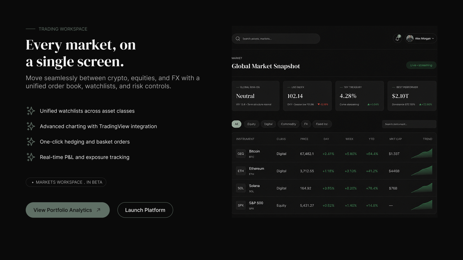
Every priority signal should lead to the next useful step. A change in performance may open its asset contributors. A rise in exposure may reveal the affected sectors or regions. A benchmark variance may lead to the allocation or market movement behind it. The goal is not to prescribe an investment decision, but to reduce the effort required to understand the evidence.
Measure whether the dashboard improves decisions
Interface quality should be assessed through the work it improves. Useful measures include time to identify a material change, time to trace its cause, repeated manual exports, avoidable navigation and the number of conflicting metric definitions used across teams. Combining these signals with structured user feedback helps product teams refine the dashboard without adding unnecessary complexity.
Investment clarity is not the amount of data on screen. It is the speed and confidence with which investors can understand what changed, why it matters and what decision should come next.
The SIGNAL Framework for Investment Dashboards
Select
Define the investment decision the dashboard must support before choosing metrics.
Identify
Choose the performance, risk and exposure signals that can materially affect that decision.
Ground
Place every signal in benchmark, time, allocation and market context.
Navigate
Create a clear path from portfolio overview to drivers, comparisons and supporting evidence.
Assess
Help users evaluate the significance, reliability and urgency of each change.
Learn
Review outcomes and recurring questions to improve definitions, rules and dashboard structure.
How to Improve an Existing Investment Dashboard
Start with the investment decisions each role needs to make before selecting metrics.
Prioritise the performance, risk and exposure signals that genuinely require attention.
Connect every important signal to assets, allocation, benchmarks, market conditions and historical context.
Show data freshness, calculation context and incomplete states so users can judge reliability.
Use consistent definitions for performance, risk, exposure, allocation and benchmark comparisons.
Measure whether the dashboard reduces analysis time, manual exports and unnecessary navigation.
Use progressive disclosure so users can move from portfolio health to deeper evidence when needed.
Have a question about this insight?
Send Lokomax a focused question about the product, workflow or design decisions covered in this article.
Turn Investment Data Into a Decision Advantage
Lokomax designs decision ready financial products that make complex performance, risk and market information easier to understand and act on.