
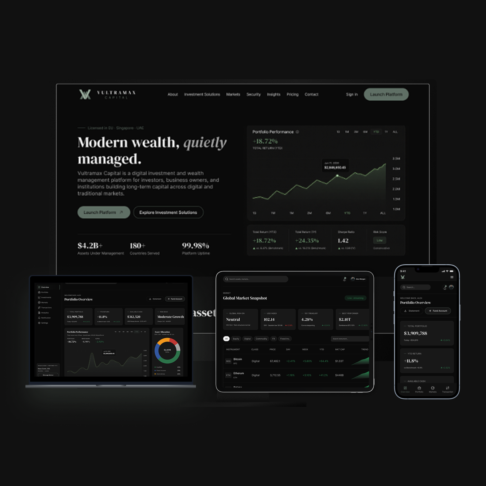
Designing Trust in Digital Wealth Platforms
Trust in a wealth product is not created by polished charts alone. It is built when every balance, risk signal, transaction and decision can be understood and verified.
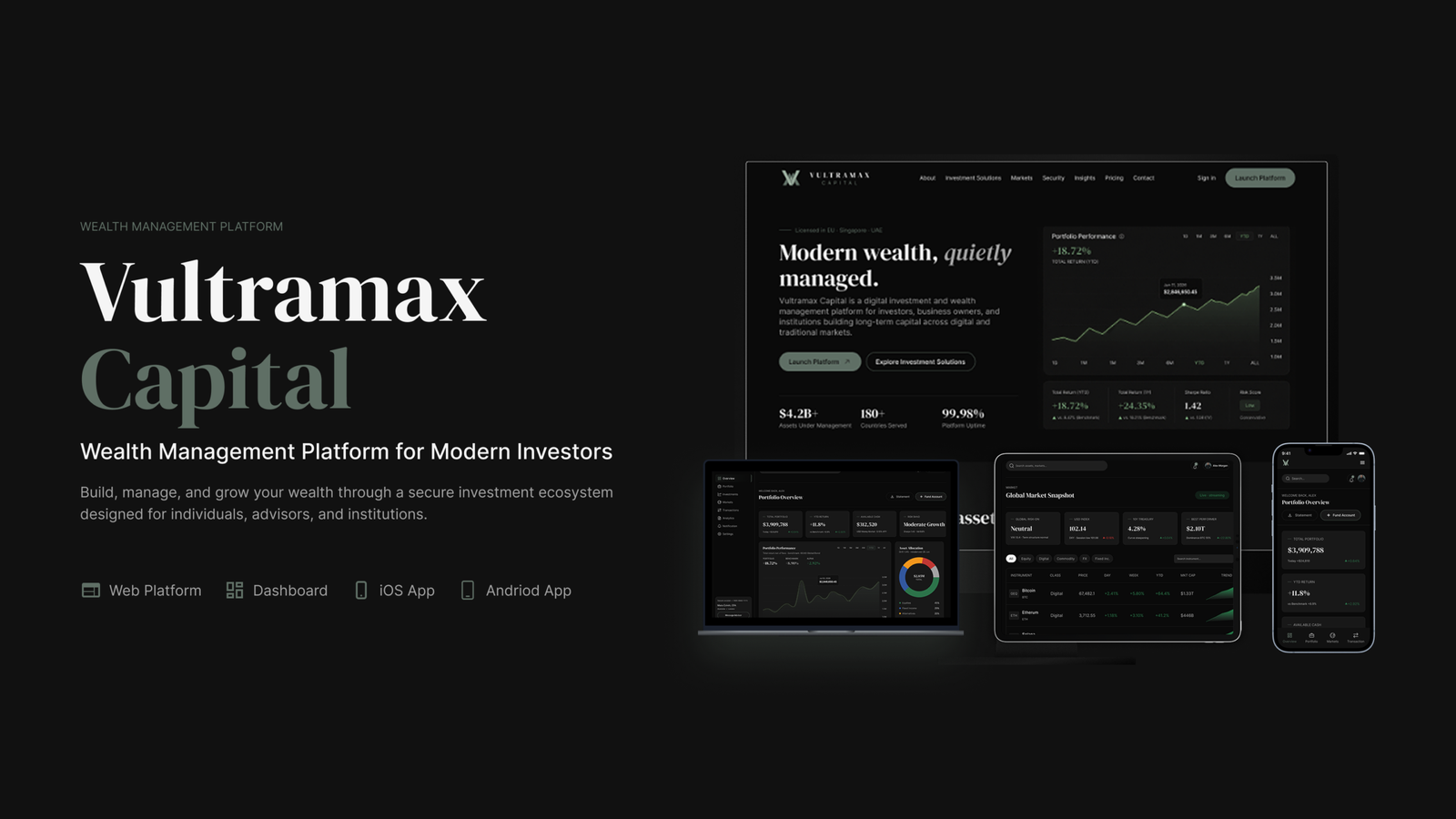
Digital wealth platform design succeeds when users can understand what they own, what changed, what may happen next and what action is safe to take. Visual polish helps, but credibility comes from a deeper product system: transparent data, consistent language, visible safeguards and deliberate control over high risk moments.
For investors, uncertainty is not an edge case. Markets move, fees compound, forecasts change and every transaction carries consequence. A platform that hides this complexity behind decorative dashboards may look professional while quietly increasing anxiety. A trustworthy platform does the opposite. It turns complexity into evidence without pretending that uncertainty has disappeared.
This article focuses on product design rather than investment advice. The goal is to show how digital teams can make financial interfaces more understandable, accountable and resilient.
Four Foundations of Trustworthy Wealth UX
Evidence Before Persuasion
Show data sources, timestamps, calculation context and transaction states before asking users to act.
Explain The Number
A balance becomes useful when the user can see what changed, why it changed and whether it is settled or estimated.
Design For Consequence
High impact actions need review states, explicit fees, risk language and recoverable confirmation paths.
Make Trust Consistent
Security, language, support and data presentation must reinforce one another across every screen.
Trust Is an Interface Property, Not a Marketing Claim
Financial brands often describe trust as a reputation problem solved through credentials, testimonials and security badges. Those signals matter, but users judge the platform continuously through its interface. A delayed balance without a timestamp, a performance chart without a benchmark, or a withdrawal state without a clear timeline can weaken confidence faster than a polished campaign can rebuild it.
The interface therefore needs to answer four questions at the moment they arise: What am I seeing? Why did it change? What can I do? What happens if I proceed? When those answers are visible, users can make informed decisions. When they are scattered across tooltips, legal pages and support tickets, the product transfers its complexity to the customer.
Clarity must survive market volatility
Calm conditions can hide weak information architecture. During rapid market movement, users scan rather than study. Labels, status indicators and warnings must remain legible under pressure. Gains and losses should not rely on colour alone. Pending, settled and estimated values should be distinct. Forecasts must look different from historical results. Risk language should explain consequence without creating panic.
Security must be experienced, not merely stated
Two factor authentication and encryption are essential, but users also experience security through session visibility, device management, withdrawal confirmations and clear records of sensitive changes. A trustworthy flow shows what is happening, provides a route to challenge unexpected activity and avoids surprising the user after commitment.
Designing The Decision, Not Just The Dashboard
A portfolio dashboard is only one surface in a wider decision system. Research, onboarding, funding, allocation, monitoring, withdrawal and support all shape perceived trust. The strongest products connect those moments with consistent definitions and state changes.
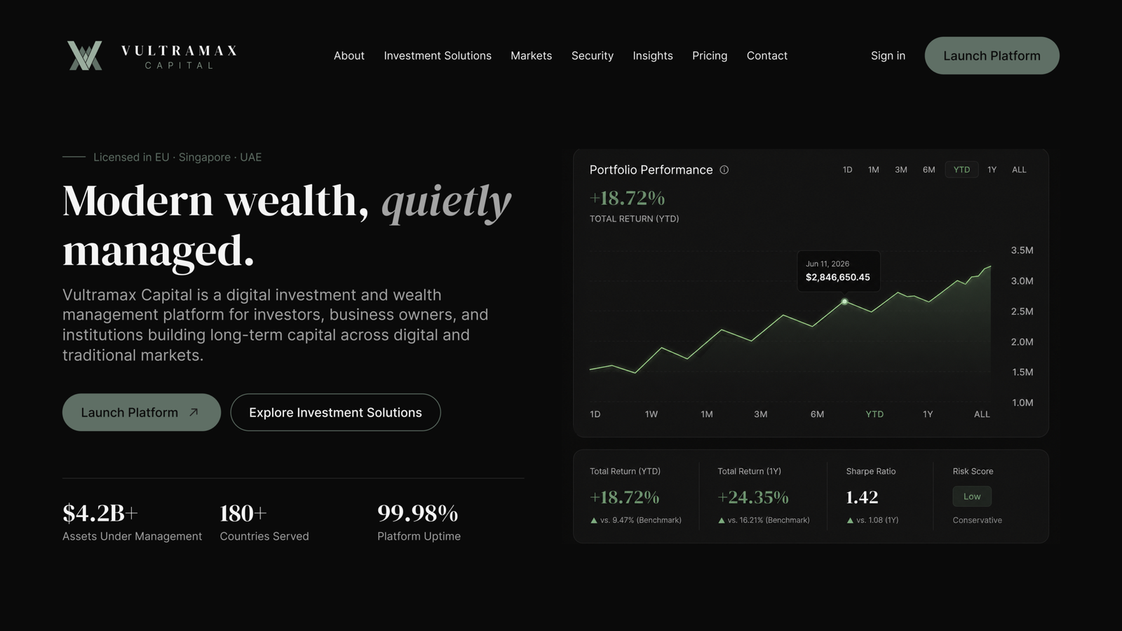
Consider performance reporting. A percentage without a time period is ambiguous. A chart without deposits and withdrawals can create a misleading narrative. A projected return without assumptions may be interpreted as a promise. Product teams should define a shared data dictionary and expose the context necessary to interpret each metric. The design system should then encode how actual values, estimates, benchmarks and warnings appear everywhere.
Trust also depends on restraint. Interfaces should not use urgency, default selections or celebratory motion to push users toward unsuitable financial actions. The product can support confident action while preserving space for review, comparison and cancellation.
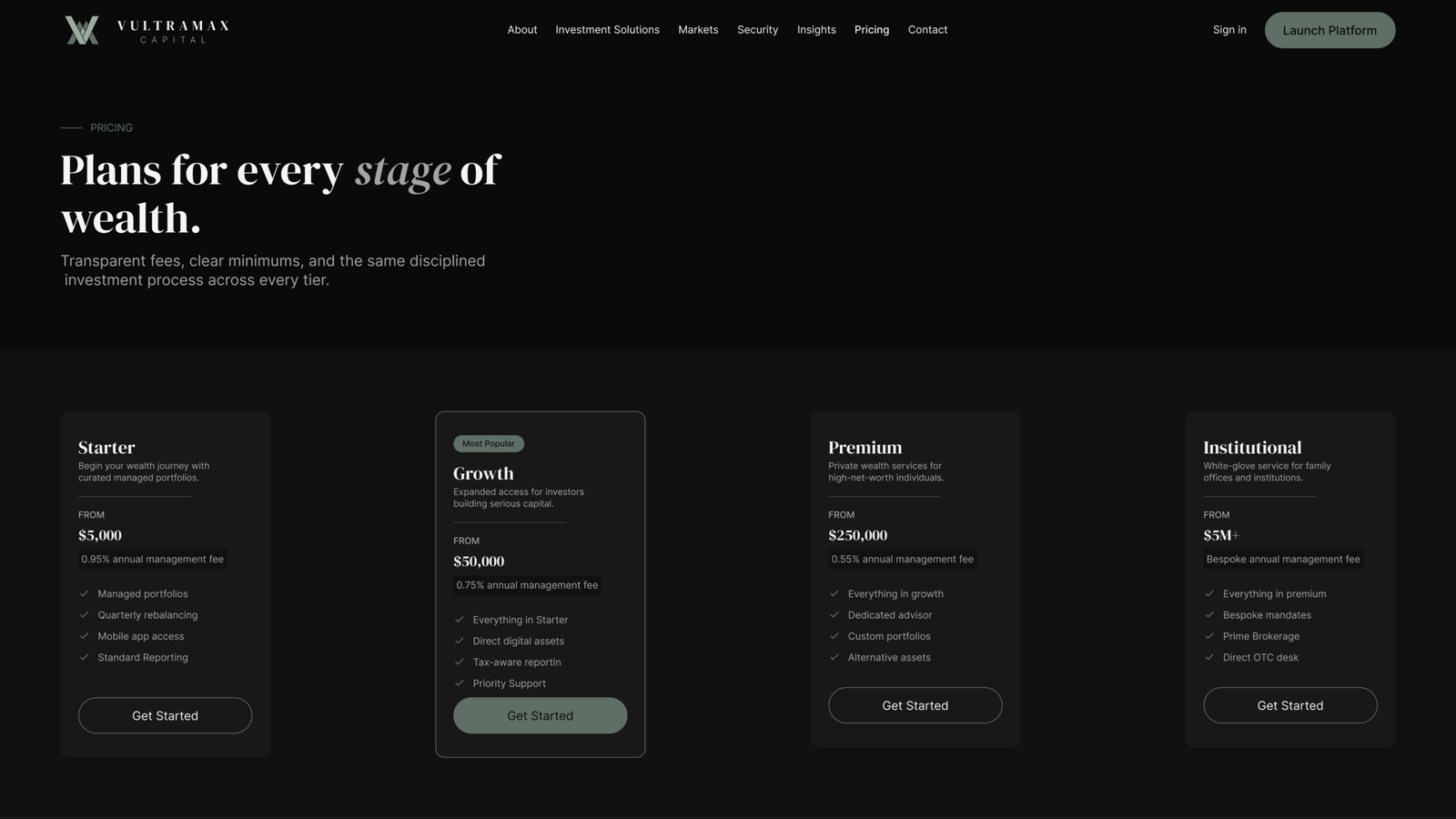
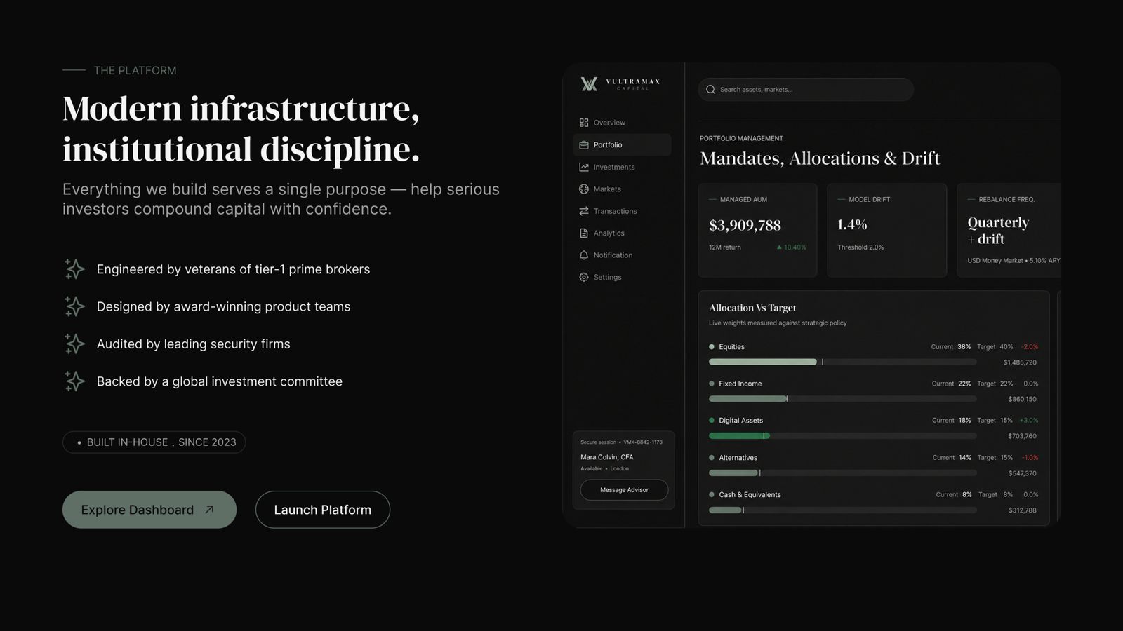
Explore the Vultramax wealth platform systemA trustworthy wealth interface does not remove uncertainty. It gives users enough evidence and control to navigate uncertainty responsibly.
The TRACE Framework for Wealth Product Trust
Transparent
Identify the source, timing, status and limits of every important value.
Reassuring
Make safeguards and support visible without relying on vague security language.
Accountable
Preserve receipts, activity history and explanations for consequential changes.
Considerate
Avoid coercive patterns and make risk, fees and alternatives understandable.
Explainable
Connect charts, forecasts and recommendations to plain language reasoning.
A Practical Trust Audit
Audit every balance, chart and forecast for source, timeframe and status.
Separate historical performance, current value and projected outcomes visually and verbally.
Review deposits, trades and withdrawals for fees, consequences and recoverable confirmation.
Test important journeys with users who have different levels of financial knowledge.
Document financial language and metric definitions as part of the design system.
Treat accessibility, security and customer support as connected trust infrastructure.
Have a question about this insight?
Send Lokomax a focused question about the product, workflow or design decisions covered in this article.
Building a wealth platform users can understand?
Lokomax designs fintech dashboards, mobile investment experiences and scalable product systems around clarity, control and responsible decision making.